PHOTOGRAPHERS PETROVSKY & RAMONE
ENTERPRISE IDENTITY
WEBSITE FOR DESKTOP/MOBILE DEVICES
SELF-HOSTED VIDEO INTEGRATED
TYPEFACES: BOMBE CTM & MONYLOP
CONTENT: PHOTOGRAPHY, VIDEO
AMSTERDAM, THE NETHERLANDS
2023
Photography/film duo Petrovsky & Ramone have a distinguished reputation for shooting extraordinarily seductive frames. Rich in colour, their rebellious elegance in depicting beauté, the human physique and sensuality, for fashion campaigns, publications and ballet, indicates that their sheer experimental setting, in viewing something per se, presses at a playful muse that cuts away at a freestyle and universal drama.
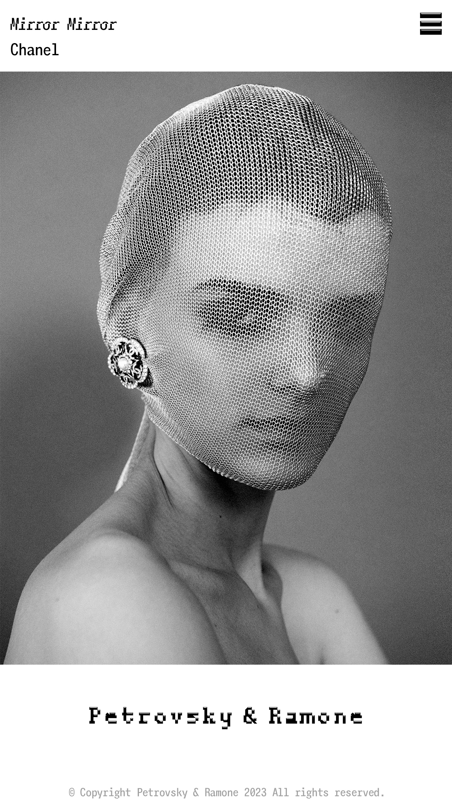
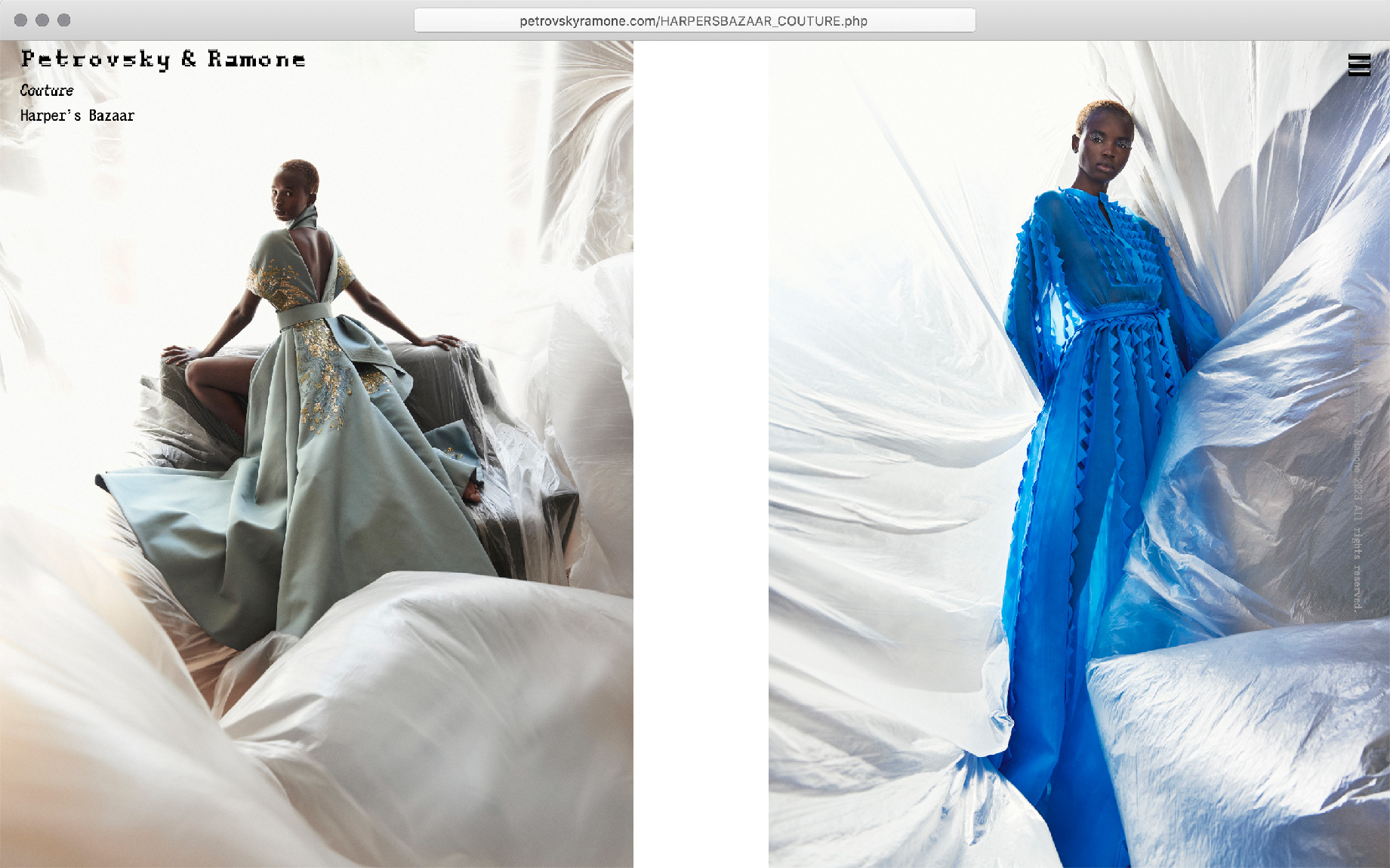
Establishing their complete website, within ninety days, comprised with authorship, image selection and the sequencing of all shoots, D. G. M. visualises the storytelling rhythm behind the exposures to both a horizontal and vertical order. The website is built entirely from scratch and without a third-party platform nor cookies. All typefaces are self-prepared, including the mint logotype web-fount entitled Bombe.
Meticulous adjustments where performed to the original typeface Turing by D. G. M. (2007) thence renamed Bombe (2023), of which now occupies a monospace. The Monylop Principle as well as additional highlights were applied to the complete character-set, making Bombe the first colour-fount D. G. M. has implemented. The typeface Bombe, for the logotype, is not displayed as a graphic replica, but is a true typeface web-fount, thus the highlights in the typeface file are actually defined as opaque, thus Bombe is typed out with that feature embedded. At differing screen widths the Petrovsky & Ramone logo splits onto two lines.
Without hesitation Bombe became the face of Petrovsky & Ramone in order to distinguish an unexpected tone of anima, of which overlays all content of the website, standing firmly in self-control. The perspective of Bombe is digitally perpendicular, needless to say as is their format of film and photography. The body text is set in Monylop.


The website handles both X/Y (desktop/handheld) device layouts. The X version renders the photoshoots to fully fit the height of the browser/fullscreen, for viewing maximisation. These high-resolution shots sit side-by-side inside a horizontal tapestry, scroll direction of the page proceeds to the right. This configuration for observation is reminiscent of glossy magazine-spread quality, the glass screen imitating spot varnish. All photo selection, ordering and comparison was orchestrated by D. G. M.
http://www.petrovskyramone.com
Bombe → Monylop →